That's what "Avatar" and "Alice in Wonderland" were about--going into new realms. new worlds. (Kevin Feige, Marvel Studios President)
That describes the appeal for me of "The Cloud-Creature That Menaced Two Worlds."
Although I enjoyed the recent article on that issue, I was surprised that it didn't include any of the panels which make that issue such an unforgettable visual experience.
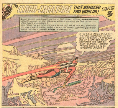
When it comes to entering "new realms, new worlds", take a look at the first panel of page 17:

The detail of the background with its narrow color palette of pink, orange and lavender creates a visual impact that, over four decades later, I simply cannot forget. When the story was reprinted in Strange Adventures #241 exactly ten years later, the background was colored differently in light pastel tints which provided a better contrast to Adam's red costume and in no way diminished the beauty of the panel:

If DC ever had an old-fashioned coloring contest, that is the panel which they should use.
Other great panels include:
- Page 12 (the last four panels) which portray Adam falling into an erupting volcanic crater with its searing heat and seething smoke :

- Page 13 (the last two panels) where you can almost hear the hissing of Adam's ray-gun turning water into vapor:

Could anyone ever draw natural phenomena like Infantino? And his work somehow never that had a cluttered look no matter how much detail had been packed into the page or panel:

Concerning the cover of MIS #81, it's totally ridiculous except for the background color. The top edge is an intense lavender which becomes diffused and becomes a light lilac color as it gets lower on the cover. It suggests a desert dawn/dusk and to see a mint cover with its sheen enhancing this color effect is a sight to behold:

That color effect reminds me of the cover of MIS #59 which has an intense green along the top edge, but which get lighter as the eye goes down:

Considering that we are living in times when visual imagery is competing with plot in movies (e.g., Avatar). re-examining the artistic glories of "The Cloud-Creature That Menaced Two Worlds" makes one realize just how far ahead of his time Infantino was.
Comments by Pat: All excellent points! Definitely one of my flaws as a comics blogger at times is the insufficient attention paid to the artwork. M. Hamilton clearly lingered over the drawings on this one. That first page of the third chapter really is something to behold.


{ 0 nhận xét... read them below or add one }
Đăng nhận xét